W I N D H A M M O U N T A I N
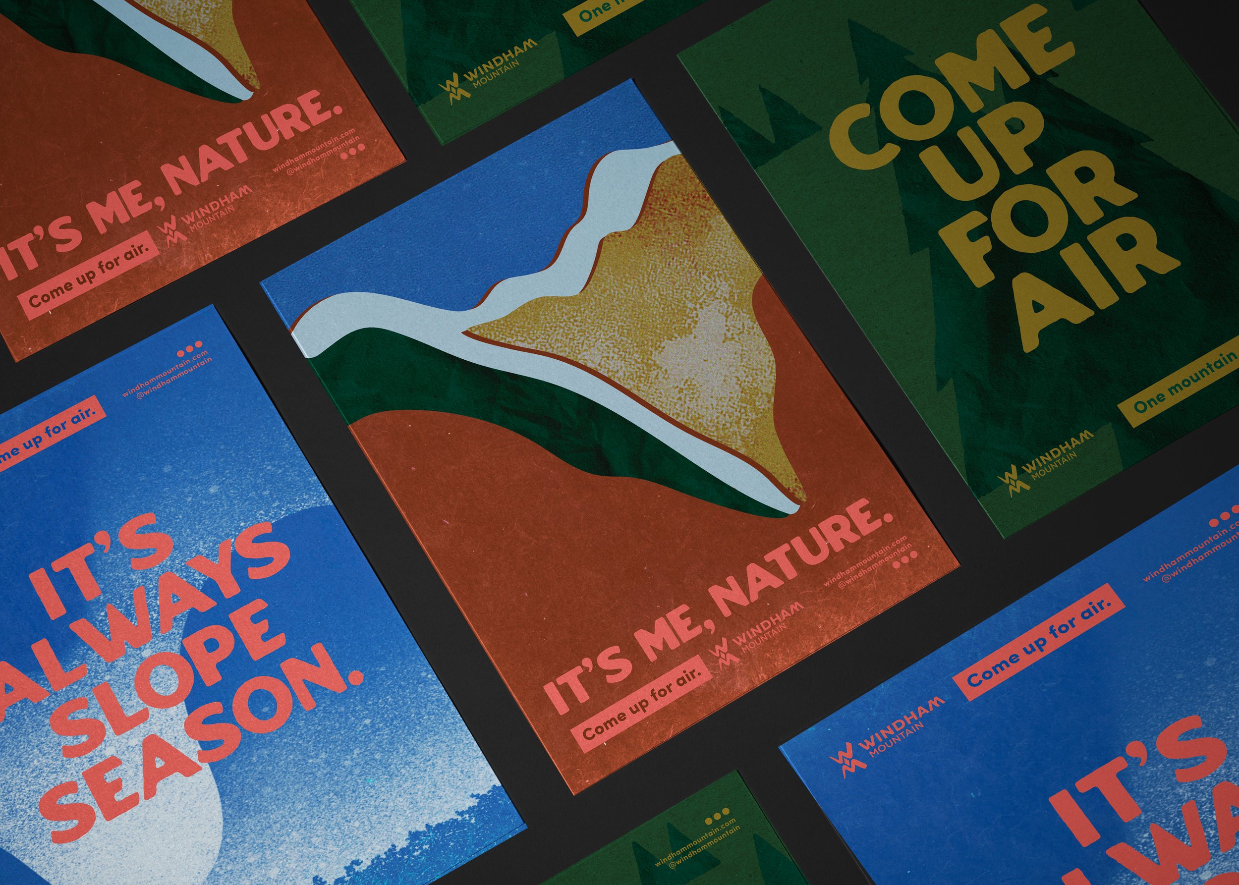
A best-in-class mountain, Windham was looking to differentiate its offerings from other properties in the area. BEST concepted, wrote and designed their first-ever brand campaign, Come Up for Air, with legs to ski future seasons.
Brand Campaign / Copy / OOH / Print / Social / Radio

The community responded and Windham saw year-over-year growth in all areas.
The campaign — which spanned on-site collateral, OOH, digital, print, radio, social and paid advertisements — was also selected as a finalist for the National Ski Areas Best Overall Marketing Campaign.
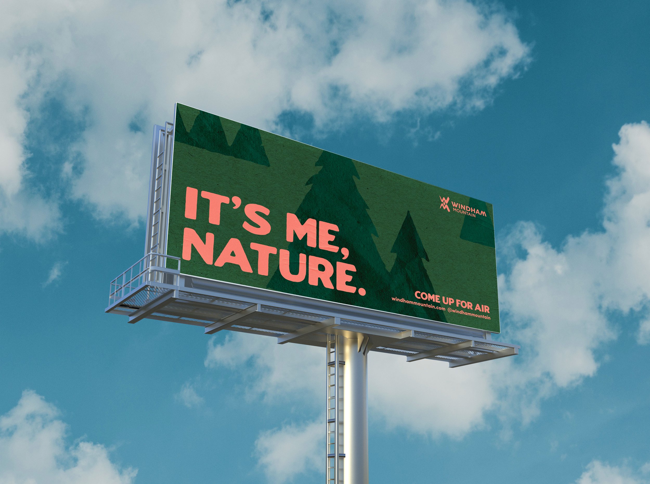
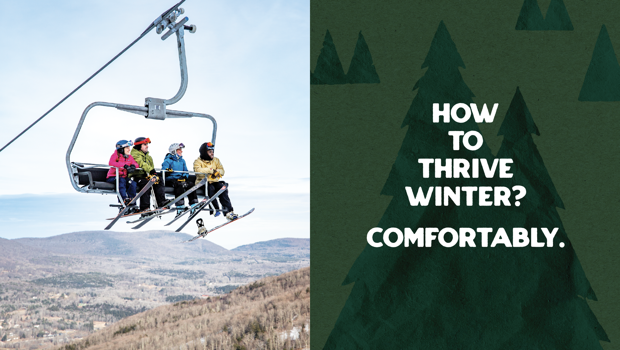
With a welcoming, inclusive call-to-action, we acknowledge our community’s collective burnout but also the relief nature provides.
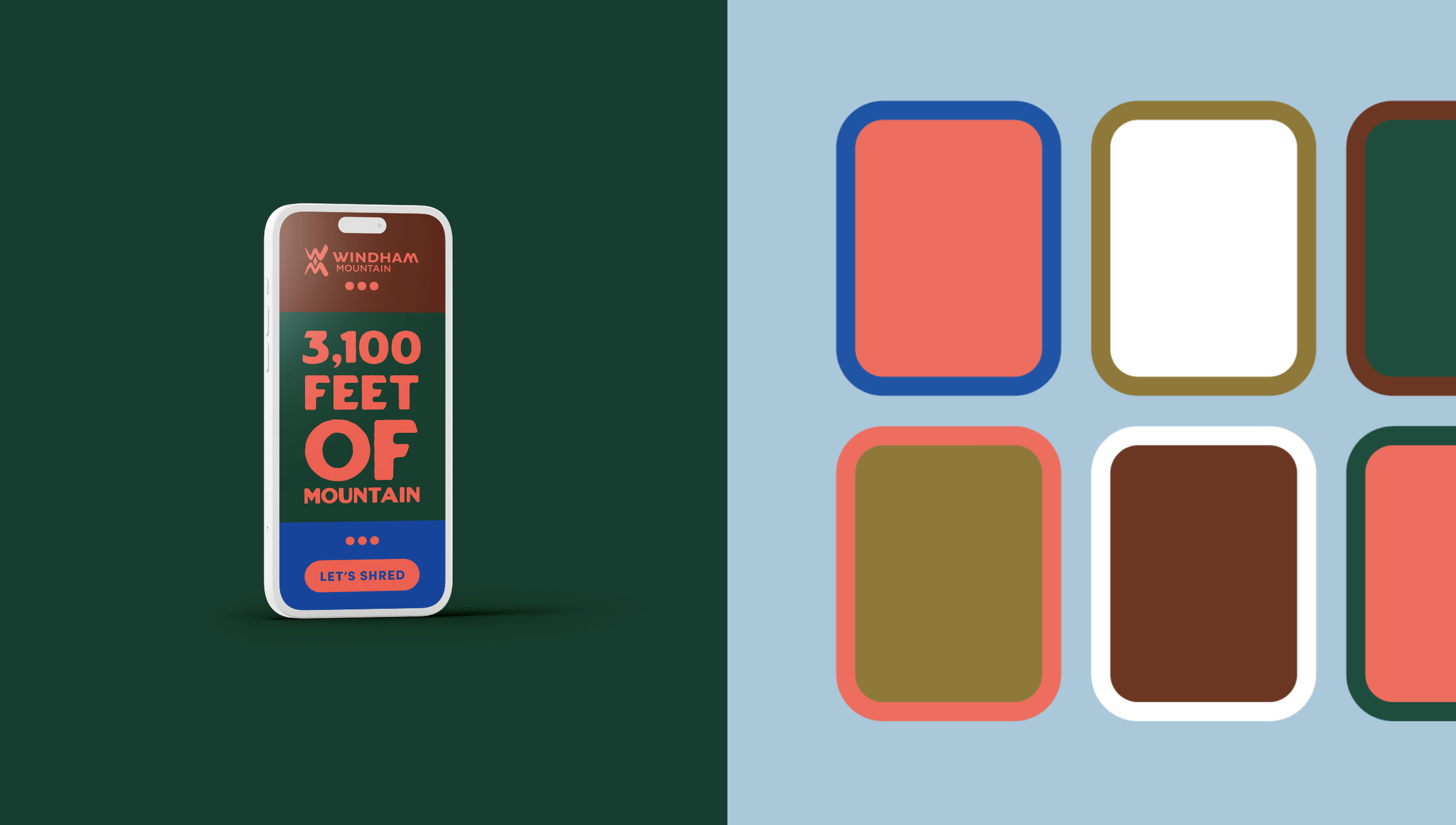
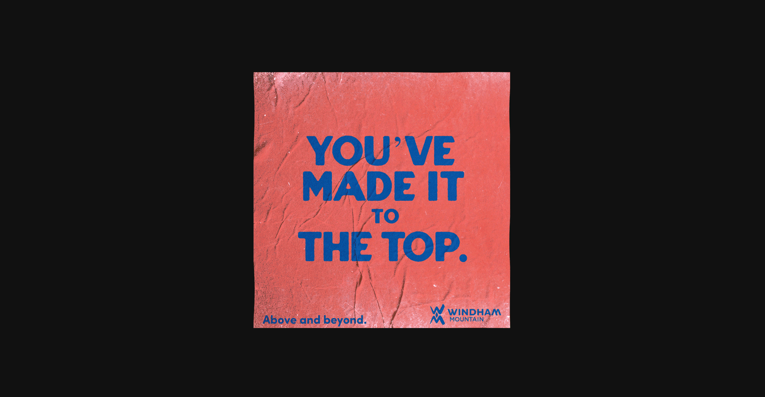
Campaign copy is direct with a hint of New York wit. Colors are an extension of, but in line with the brand’s primary palette. Creative inspiration comes from vintage posters, craft, textures, and nostalgia.
Utilizing pre-BEST shot imagery, we were able to revive Windham’s existing brand assets into something that felt as new as fresh pow.
Windham got a new look by a non-local, non-BEST studio a year later to mixed results. We wrote our thoughts on that and things to consider when rebranding here.


“The strength of the creative and clear direction for us to operate within absolutely helped us achieve this.”
— Kate Sullivan